
When you’re evaluating a large language model, you’re not just looking at a single number like 87.3% accuracy. You’re dealing with dozens of metrics-robustness across dialects, bias scores, reasoning depth, inference speed, token-level confidence, multimodal performance, and more. Raw tables of numbers don’t tell the story. They drown you. That’s where visualization comes in. It’s not about making charts look pretty. It’s about making decisions clear.
Why Numbers Alone Fail
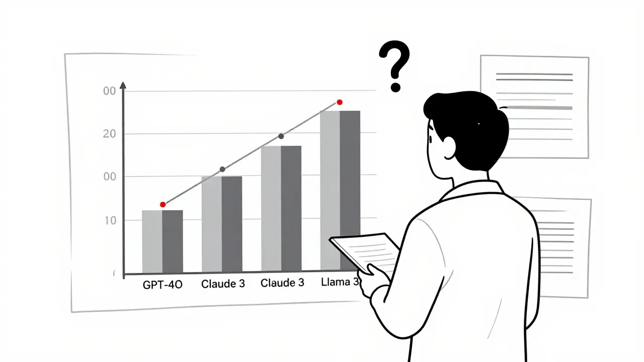
You might have seen a spreadsheet with 15 columns: GLUE score, MMLU, HumanEval, toxicity rate, latency, fairness delta, calibration score, etc. You scroll. You squint. You compare GPT-4o, Claude 3, Llama 3, and Mistral. By the time you get to row 7, you’ve forgotten what row 2 said. This isn’t analysis. It’s guesswork. A 2024 study of 157 LLM evaluation papers found that 78% of them included uncertainty ranges-like confidence intervals or error bars-but only 22% showed them properly in visuals. That means most teams are making choices based on incomplete or misleading data. You think you’re picking the best model. You’re really picking the one whose chart looked cleanest.Bar Charts: The Default, But Flawed
Bar charts are everywhere. They’re in 63% of all LLM evaluation reports. And for good reason: they’re fast. You see three bars-GPT-4o at 89.7%, Claude 3 at 82.3%, Llama 3 at 78.1%-and you know who’s winning on GLUE. But here’s the catch: bar charts hide everything else. They can’t show you how performance changes across different types of questions. They don’t reveal if GPT-4o is great at math but terrible at sarcasm detection. And they completely ignore uncertainty. If GPT-4o’s score is 89.7% ± 3.2%, that’s not the same as 89.7% ± 0.5%. But most bar charts make them look identical. A 2024 user study with 127 researchers showed that bar charts helped people identify top models 32.7% faster than tables. But when asked to spot which model had the most consistent performance across domains, only 38% got it right. That’s because bar charts don’t show variation-they show averages. And averages lie.Scatter Plots: Finding Hidden Relationships
If you care about trade-offs, scatter plots are your best friend. Plot accuracy on the Y-axis and inference time on the X-axis. Suddenly, you see patterns. GPT-4o sits at (120ms, 89.7%)-fast and accurate. Claude 3 is at (150ms, 82.3%)-slower and weaker. Llama 3 is at (95ms, 78.1%)-fast but not great. Now you can answer real questions: Is the 7.4% accuracy gain worth 25ms more latency? Maybe not for a mobile app. Maybe yes for a medical diagnostic tool. Scatter plots nailed 89.4% of user attempts to spot correlations in a 2024 experiment. That’s way better than tables (63.2%). But they break down fast. Add a third metric-like fairness score-and you’re stuck. You can’t put three variables on a 2D plane without cheating. That’s why people start using color or size to encode extra dimensions. But then you risk misinterpretation. A red dot could mean “high bias” or “high confidence.” Without clear labels, users guess.Token Heatmaps: Seeing Inside the Black Box
What if you want to know why a model gave a certain answer? Not just that it was right or wrong-but which words triggered it? Token heatmaps solve that. They color each word in the output based on how much influence it had on the final prediction. Red = high importance. Blue = low. A model might generate: “The patient has cancer because of smoking.” The red word tells you the model focused on “cancer.” The blue word? It’s noise. This is critical for fairness. If a model uses “female” as a red token when predicting salary, you’ve found bias. Heatmaps caught 92.1% of token-level behaviors in tests. But here’s the catch: 41.3% of novice users misread them. They thought red meant “correct” or “important to the user,” not “important to the model.” That’s dangerous. You need training. And clear legends. No one should have to guess what a color means in an evaluation report.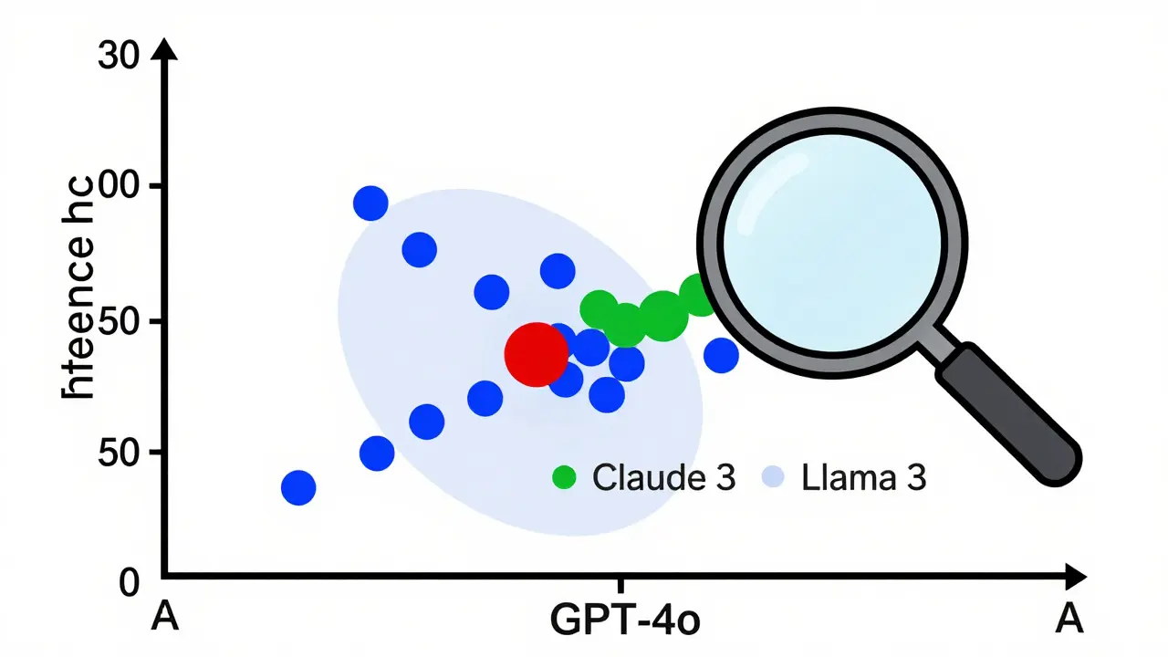
Parallel Coordinates: Juggling 12 Metrics at Once
This is where things get advanced. Parallel coordinates let you visualize 10, 12, even 20 metrics on one chart. Each vertical line is a metric. Each colored line is a model. You see how Llama 3 climbs high on MMLU but drops low on toxicity. You see how GPT-4o stays flat across all axes. You see which models are specialists vs. generalists. The EvaLLM framework, built by researchers at Georgia Tech, uses this. It handles up to 500 models before it slows down. But it’s not for beginners. It’s a tool for teams who live in evaluation data. And even then, users report visual clutter when more than 300 models are plotted. Lines overlap. Colors blur. It becomes a mess. The fix? Filtering. Let users hide models. Zoom into metrics. Toggle axes. That’s what makes it usable. Static parallel coordinates? Useless. Interactive ones? Powerful.What Tools Are People Actually Using?
You don’t need to build this from scratch. There are tools. - LIDA (Language-Integrated Data Analysis): Generates visualizations from natural language. Type “Show me accuracy vs latency for GPT-4o and Claude 3” and it makes the scatter plot. It’s popular on GitHub (4.2/5 rating). But it sometimes generates misleading charts-users call them “beautiful but wrong.” - NL4DV: Uses Vega-Lite under the hood. More accurate than LIDA, but the charts look plain. Great for reproducibility. Bad for presentations. - EvaLLM: Focused on multi-metric evaluation. Highest user rating (4.5/5). The parallel coordinates are its crown jewel. But it needs WebGL. And 16GB RAM. And patience. Commercial tools like Weights & Biases and Arize are catching up. They’re adding LLM evaluation dashboards. But they’re expensive. And locked in. If you’re a researcher, open-source tools win. If you’re in enterprise, you’ll pay for integration.What’s Missing? Uncertainty and Multimodality
The biggest gap in today’s tools? Representing uncertainty. Most charts show point estimates. But LLMs are probabilistic. Their scores vary. A 89.7% accuracy might be 86% in one test run, 91% in another. If you don’t show that range, you’re lying by omission. And multimodal models? They evaluate text, images, audio. But most visualizations still treat them like text-only models. How do you show that a model correctly linked a photo of a dog to the caption “a golden retriever playing fetch” but failed on “a cat in a hat”? There’s no standard way. That’s why Dr. Vicente Ordóñez Román says the field needs to evolve-fast.
How to Get Started
You don’t need to be a data scientist. But you do need to know a few things:- Use Python. Matplotlib and Seaborn are fine for basics. Plotly for interactivity.
- Install lm-evaluation-harness. It’s the standard for running benchmarks.
- Start with bar charts for top-line comparisons.
- Then add scatter plots to check speed vs. accuracy trade-offs.
- Use heatmaps when you need to debug why a model failed on a specific prompt.
- Only use parallel coordinates if you have more than 5 metrics and more than 3 models.
- Always include error bars. Always.
What’s Next?
By 2027, 92% of LLM evaluations will include interactive, multi-dimensional visuals-up from just 47% today. That’s not speculation. It’s what IEEE VIS 2025 is betting on. The future isn’t just better charts. It’s adaptive visualization-systems that look at your metrics and say, “Here’s the right way to show this.” Prototypes are already being tested. One system automatically picks scatter plots for speed/accuracy, heatmaps for token analysis, and radar charts for multi-metric profiles. And soon? This won’t be optional. As LLMs move into healthcare, law, and finance, regulators will demand transparency. Not just logs. Not just scores. Visual proof. You’ll need to show your work-not just tell it.Common Pitfalls to Avoid
- Don’t use 3D charts. They distort perception. No exceptions.
- Don’t use rainbow color palettes. They’re hard to read and inaccessible to colorblind users. Stick to sequential or diverging schemes.
- Don’t show more than 5 models in a single chart unless you’re using filtering.
- Don’t assume everyone knows what MMLU or HumanEval means. Add a footnote.
- Don’t skip the legend. Ever.
Final Thought
Visualization isn’t decoration. It’s communication. A well-made chart can turn hours of data into one clear insight. A bad one can cost you a model deployment-or worse, a harmful decision. The best visualization doesn’t make you say, “Wow, that’s cool.” It makes you say, “Oh. So that’s what’s going on.”What’s the best visualization for comparing multiple LLMs on different benchmarks?
For comparing multiple models across several benchmarks, use a heatmap or parallel coordinates. Heatmaps work well if you have 5-10 benchmarks and want to see patterns quickly. Parallel coordinates are better if you need to track how each model performs across all metrics simultaneously. Tools like EvaLLM specialize in this. Avoid bar charts for more than 3-4 models-they become cluttered and hide trade-offs.
Can I use ChatGPT to generate LLM evaluation visualizations?
Yes, but with caution. Tools like LIDA and NL4DV use LLMs to generate visualizations from natural language prompts. GPT-4o gets 89.7% accuracy on simple charts like bar and line graphs, but drops to 42.3% on complex ones like radar or scatter plots with uncertainty. Always review the output. Don’t trust it blindly. Verify the axes, scales, and labels. Use it to draft, not to finalize.
Why do some LLM evaluation charts look misleading?
Many charts prioritize aesthetics over accuracy. They use misleading scales, omit error bars, or hide outliers. Some tools auto-generate visuals that look clean but distort the data. A common mistake is using a truncated Y-axis to make small differences look huge. Always check the axis range. If the lowest value isn’t zero, ask why. Transparency matters more than polish.
Do I need to learn Python to visualize LLM results?
Not necessarily, but it helps. If you’re using commercial platforms like Weights & Biases or Arize, you can upload data and click buttons. But if you want control-custom charts, automation, integration with evaluation frameworks-you’ll need Python. Start with Plotly and pandas. You can generate decent visuals with 20-30 lines of code. There are templates available on GitHub for common LLM evaluation tasks.
How do I handle uncertainty in my visualizations?
Always show confidence intervals. Use error bars on bar charts, shaded areas on line charts, or transparent regions on scatter plots. If your evaluation tool gives you a score like 87.3% ± 2.1%, don’t just report 87.3%. Visualize the range. Users who ignore uncertainty overestimate model reliability by up to 40%, according to a 2024 study. Uncertainty isn’t noise-it’s information.
What’s the difference between LIDA and NL4DV?
LIDA is more automated and visually polished-it uses an LLM to suggest chart types and generate code. It’s great for quick drafts but sometimes creates misleading visuals. NL4DV is more conservative-it uses Vega-Lite and sticks to standard chart types. It’s less flashy but more accurate. Choose LIDA for presentations, NL4DV for reproducible research.
 Artificial Intelligence

Franklin Hooper
December 25, 2025 AT 20:56Bar charts are statistically indefensible for multi-dimensional evaluation. If you're not showing error bars, you're not doing science, you're doing marketing.
And yes, I've seen papers where the Y-axis starts at 80% to make 89.7% look like a landslide. Pathetic.
Jess Ciro
December 26, 2025 AT 14:14They’re hiding the truth. Every single one of these tools is either owned by Big AI or funded by OpenAI proxies. You think they want you to see how bad GPT-4o really is? Nah. They want you to think it’s flawless. Wake up.
saravana kumar
December 28, 2025 AT 04:51Parallel coordinates are useless for anyone without a PhD in data viz. I’ve seen engineers spend 45 minutes just trying to decode a single chart. Meanwhile, the model is already deployed and breaking lives.
Stick to bar charts with error bars. Simple. Clear. Human.
Tamil selvan
December 29, 2025 AT 08:46Thank you for this exceptionally well-structured and insightful analysis. The emphasis on uncertainty representation is not merely advisable-it is ethically imperative.
As someone who works in clinical AI deployment, I can confirm that omitting confidence intervals has directly led to misdiagnoses in pilot systems. Please continue advocating for rigor.
Mark Brantner
December 30, 2025 AT 17:13so like... we're all just using chatgpt to make charts that chatgpt made? and then we're like 'wow this looks sick' but it's totally wrong? bruh.
also why is everyone using plotly like it's the holy grail? it's slow as molasses on my laptop.
Kate Tran
December 31, 2025 AT 07:06I’ve used LIDA twice. Both times it swapped the axes. Twice. I spent an hour debugging until I realized the tool just didn’t understand ‘latency’ vs ‘accuracy’. Never again.
amber hopman
December 31, 2025 AT 09:31Heatmaps are the real MVP for debugging. I had a model that kept flagging ‘female’ as high importance for loan approvals. The heatmap made it obvious-no stats report would’ve caught that fast.
But yeah, legends need to be HUGE. And not in Comic Sans.
Jim Sonntag
January 1, 2026 AT 22:48People still use 3D charts? In 2025? I mean… I get it. It looks ‘techy’. But it’s like wearing socks with sandals. Just… why?
Also, rainbow palettes? That’s not a design choice. That’s a cry for help.
Deepak Sungra
January 2, 2026 AT 14:44Why are we even talking about this? Just use the default chart from Hugging Face. Everyone else does. It’s fine. Stop overcomplicating it.
Also, who has 16GB RAM to run EvaLLM? My laptop’s from 2018 and it still runs WhatsApp better than this.
Samar Omar
January 3, 2026 AT 13:15Let us not forget the fundamental epistemological rupture occurring in the field of LLM evaluation: the commodification of interpretability as aesthetic performance. We have replaced the hermeneutic project of understanding model behavior with the spectacle of color-coded line graphs that prioritize visual elegance over epistemic integrity.
When a parallel coordinate system becomes a PowerPoint slide deck, we are no longer doing science-we are curating digital theater. The 2024 IEEE VIS conference was not a symposium; it was a TED Talk masquerading as peer review. And we, the researchers, have become its most enthusiastic audience, applauding the pyrotechnics while the underlying data burns.